

Sales dashboard
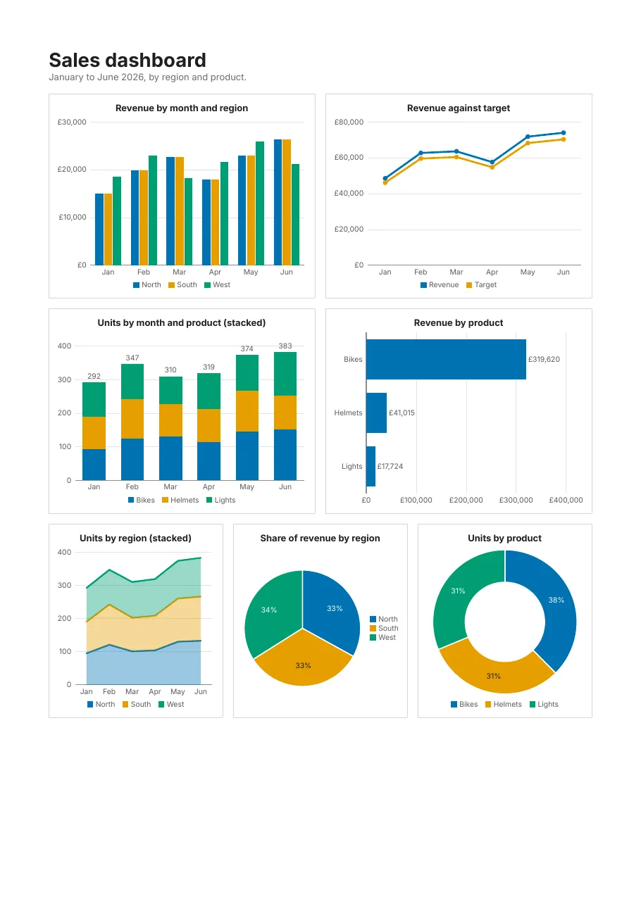
Seven charts from one dataset of sales: columns side by side and stacked, bars, lines, stacked areas, a pie and a doughnut. Charts are vector graphics, so they print sharply at any size, and each is a figure with alternative text for screen readers.
Standards: PDF/A-2b · PDF/UA-1, checked with veraPDF on every change. Download the PDF.
What it shows
Section titled “What it shows”- Column, bar, line, area, pie and doughnut charts
- Stacked series, and a series per region with
seriesBy - Value labels, legends and currency formats on the axes
- Charts described for screen readers (PDF/UA-1)
The template
Section titled “The template”# yaml-language-server: $schema=../schema/template.schema.json# Charts: columns (side by side and stacked), bars, lines, stacked areas, a pie and a doughnut, drawn as vector# graphics from one dataset. Each chart is a Figure for screen readers, with alt text. PDF/A-2b and PDF/UA-1.version: 1title: Sales dashboardculture: en-GB
document: author: Acme Ltd compliance: [pdf-a-2b, pdf-ua-1]
page: size: A4 margins: 16mm
fonts: Inter: { regular: fonts/Inter-Regular.ttf, bold: fonts/Inter-Bold.ttf }
styles: default: { font: Inter, fontSize: 8.5pt, color: "#1F1F1F" } card: { border: "0.5pt solid #D5D5D5", padding: 8pt }
data: sales: fields: { Month: date, Region: string, Product: string, Revenue: decimal, Units: int32 }
body: dataset: sales reportHeader: - padding: 0 0 10pt 0 content: - { type: text, value: "Sales dashboard", fontSize: 18pt, fontWeight: bold, tag: h1 } - { type: text, value: "January to June 2026, by region and product.", color: "#6B6B6B" }
- layout: row gap: 10pt padding: 0 0 10pt 0 content: - type: chart style: card width: 1fr height: 190pt dataset: sales category: "{Month:MMM}" seriesBy: =Region series: [ { value: =Revenue } ] format: C0 title: Revenue by month and region alt: Column chart of revenue by month for the North, South and West regions. - type: chart kind: line style: card width: 1fr height: 190pt dataset: sales category: "{Month:MMM}" series: - { name: Revenue, value: =Revenue } - { name: Target, value: =Revenue * 0.95 } format: C0 title: Revenue against target alt: Line chart of monthly revenue against target.
- layout: row gap: 10pt padding: 0 0 10pt 0 content: - type: chart style: card width: 1fr height: 190pt dataset: sales category: "{Month:MMM}" seriesBy: =Product series: [ { value: =Units } ] stacked: true labels: true title: Units by month and product (stacked) alt: Stacked column chart of units sold per month, split by product. - type: chart kind: bar style: card width: 1fr height: 190pt dataset: sales sort: [Product] category: "{Product}" series: [ { name: Revenue, value: =Revenue } ] format: C0 labels: true title: Revenue by product alt: Bar chart of total revenue per product.
- layout: row gap: 10pt content: - type: chart kind: area style: card width: 1fr height: 180pt dataset: sales category: "{Month:MMM}" seriesBy: =Region series: [ { value: =Units } ] stacked: true title: Units by region (stacked) alt: Stacked area chart of units sold per month by region. - type: chart kind: pie style: card width: 1fr height: 180pt dataset: sales category: "{Region}" series: [ { value: =Revenue } ] legend: right title: Share of revenue by region alt: Pie chart of the share of revenue by region. - type: chart kind: doughnut style: card width: 1fr height: 180pt dataset: sales category: "{Product}" series: [ { value: =Units, aggregate: sum } ] title: Units by product alt: Doughnut chart of units sold per product. detail: []Render it yourself
Section titled “Render it yourself”Save the template, put the fonts it names next to it (Inter and the Noto fonts are free, under the SIL Open Font License), and run:
tagua render charts.report.yaml --openWithout a data file, tagua render makes up sample rows from the field types; see Preview as you edit.