

Chart element
A chart of a dataset’s rows, drawn as vector graphics. Like a table, it reads its own dataset (with filter and sort, and Parent.X for the enclosing row). Rows are grouped into categories by the text of category, in the order they first appear, and each series’ value is aggregated per category. It is a Figure for screen readers, described by alt.
- { type: chart, dataset: ..., category: ..., series: ... }Example
Section titled “Example”title: Sales by monthculture: en-USdata: sales: { fields: { Month: date, Region: string, Revenue: decimal } }body: reportHeader: - content: - type: chart kind: column dataset: sales category: "{Month:MMM}" seriesBy: Region series: [{ value: =Revenue }] title: Revenue by month and region alt: Revenue by month for the North and South regions, from January to April. format: C0 width: 70% height: 180ptdata: sales: - { Month: 2026-01-01, Region: North, Revenue: 42000 } - { Month: 2026-01-01, Region: South, Revenue: 31000 } - { Month: 2026-02-01, Region: North, Revenue: 45500 } - { Month: 2026-02-01, Region: South, Revenue: 36800 } - { Month: 2026-03-01, Region: North, Revenue: 51200 } - { Month: 2026-03-01, Region: South, Revenue: 40100 } - { Month: 2026-04-01, Region: North, Revenue: 49800 } - { Month: 2026-04-01, Region: South, Revenue: 44300 }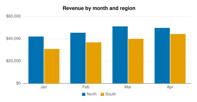
Properties
Section titled “Properties”Type: keyword · Default: column
The kind of chart.
One of:
column: Vertical bars.bar: Horizontal bars.lineareapiedoughnut: A pie with a hole in the middle.
dataset
Section titled “dataset”Type: text · Required
The dataset whose rows are charted.
filter
Section titled “filter”Type: expression
Keeps only the rows for which this is true; Parent.X reads the enclosing row.
Type: list of sort key
Row order, which is also the order of the categories.
category
Section titled “category”Type: text · Required
Text template: each row’s category (a column, a point on the line, a slice of the pie).
series
Section titled “series”Type: list of object · Required
The values to plot: one series, or several side by side or stacked.
seriesBy
Section titled “seriesBy”Type: expression
Splits the rows into a series per value of this expression, all with the one series’ value.
stacked
Section titled “stacked”Type: true or false · Default: false
Stacks the series of a column, bar or area chart instead of setting them side by side.
Type: text
Text template shown above the chart.
Type: text
What the chart shows, for screen readers (text template). Required under PDF/UA unless an artifact.
legend
Section titled “legend”Type: keyword · Default: auto
Where the legend goes.
One of:
auto: At the bottom when there are several series, and on a pie or doughnut.bottomrightnone
labels
Section titled “labels”Type: true or false
Writes each value on its column, point or slice (percentages on a pie). Default: on for pies only.
format
Section titled “format”Type: text
.NET format for the values on the axis and in labels, e.g. N0 or C0.
series
Section titled “series”Each entry of series.
Type: text
Shown in the legend. Defaults to “Series 1”, “Series 2”…
Type: expression · Required
A number per row, aggregated per category.
aggregate
Section titled “aggregate”Type: keyword · Default: sum
How the values of a category’s rows are combined.
One of:
sumavgcountminmax
Type: color
Defaults to the next color of a palette that color-blind readers can tell apart.
It also has the properties of every element and the style properties.